In a nutshell
- 🎨 Colour-coding leverages preattentive processing to turn raw numbers into instant signals; RAG rules and weekly micro-limits lower willpower and reduce budgeting anxiety.
- 🗂️ Build a practical palette: consistent hues for key categories, accessibility (high contrast, icon/texture backups), and state rings; tie alerts to rules like amber at 75% and red at 95%.
- ✅ Pros: instant comprehension, faster course-correction, and playful gamification that rewards streaks and milestones—making visibility equal motivation.
- ⚠️ Cons—and fixes: colour can oversimplify or overwhelm; counter with context-aware alerts, number overlays, high-contrast palettes, and user-controlled thresholds/snoozes.
- 🇬🇧 Real outcomes: Leah saved £68 and boosted her ISA by £50; Karthik cancelled dormant trials, saved £24, and built a £100 buffer—yielding fewer surprise reds, more steady greens.
Colour isn’t just decoration in finance apps; it’s a cognitive shortcut that turns a fog of numbers into patterns your brain grasps at a glance. In a year when UK households still feel the aftershocks of higher energy bills and rising food prices, smart visual design can lower the mental load of budgeting. By mapping categories and thresholds to hues, colour-coding transforms tracking into feedback, and feedback into habit. When your app uses colour to signal urgency, success, or drift, you act faster and with more confidence. The result is budgeting that feels less like an audit and more like a game you can win—week after week.
Why Colour-Coding Works in Personal Finance
Visual cues tap into preattentive processing—the brain’s ability to spot differences before conscious thought. That’s why a red dining-out bar feels “loud” even before you read the number. In budgeting terms, colour reduces friction by clustering behaviour: green means carry on, amber asks you to pause, red pushes you to revise plans. Research in behavioural science links such cues to stronger habit formation, especially when paired with timely prompts and small wins. The simpler the signal, the less willpower you need to maintain consistency. For UK users juggling rent, rail fares and grocery inflation, this kind of clarity cuts through decision fatigue and the anxiety of checking balances mid-month.
Colour also adds meaningful emotion to otherwise bland data. A RAG system (red–amber–green) can track categories and time: green early in the month, amber as you hit 70–85% of a limit, red beyond cap. Combine this with weekly micro-limits and you get steady cadence rather than end-of-month panic. Quick wins include:
- Default green on core bills to reduce stress, with amber only on anomalies.
- Amber nudge at 75% of a category limit; red at 95%.
- Soft reset each Monday for discretionary pots (coffee, eating out).
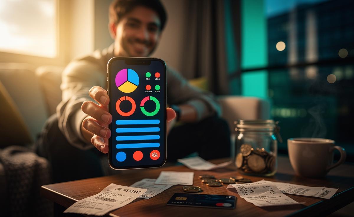
A Practical Palette for Budgets: Categories, Shades, and Limits
Start by assigning consistent hues to the big eight categories. Consistency matters more than perfect choices. Pick a palette that’s legible in dark mode, meets basic accessibility standards, and uses contrast rather than saturation alone. Think in terms of “traffic lights plus nuance”: green for essential spend on track, teal or blue for savings and investments, amber for watch-list items, and red for breaches. For clarity, blend category colour with a state colour ring (e.g., a blue savings bar with a green rim when on track, amber when lagging). The table below offers a pragmatic UK-oriented template you can adopt or adapt.
| Category | Primary Colour | Alert Colour | Typical Trigger |
|---|---|---|---|
| Housing & Council Tax | Green | Amber | Bill up 10% vs. last month |
| Utilities & Energy | Olive | Red | 85% of monthly cap hit mid-cycle |
| Groceries | Teal | Amber | 75% of budget before week three |
| Transport | Blue | Amber | 3 high-cost trips in 7 days |
| Subscriptions | Purple | Red | New recurring charge detected |
| Eating Out & Coffee | Orange | Red | Daily spend streak over 4 days |
| Savings & Investments | Navy | Amber | Contribution missed |
| Debt Repayments | Burgundy | Red | Payment due within 48 hours |
Implementation tips: lock essential bills in muted colours to avoid alarm fatigue; reserve saturated reds for action-required events; and anchor savings in reassuring blues to promote commitment. Tie colour to rules like “amber at 75%,” and add weekly caps to discretionary pots so progress feels tangible between paydays. Colour should highlight choices, not shame them, so give users a one-tap “snooze” when an alert is contextually justified (e.g., a family birthday meal).
Pros and Cons of Colour-First Budgeting
A colour-first approach can supercharge awareness—yet it can also mislead if poorly executed. Pros include instant comprehension, lower cognitive load, and faster course-correction. Colour nudges make it easier to act in the moment: skip a second takeaway, move £20 to savings, or delay a discretionary purchase until next week. Gamification—streaks, confetti on savings milestones, calming green when targets are hit—creates emotional reinforcement. Visibility becomes motivation, turning budgets from punitive to playful. For many UK users with irregular gig income or seasonal bills, these fast signals are the difference between staying ahead and scrambling at month-end.
But there are pitfalls. Why Colour Isn’t Always Better: overusing red desensitises users; decorative palettes may fail for colour-vision deficiency; and hues can oversimplify complex trade-offs (e.g., overpaying debt vs. investing). Mitigations include:
- Accessible palettes with high contrast; add icons or textures for red/green distinctions.
- Context-aware alerts that factor in payday timing and known annual costs.
- Number overlays (percent and pounds) to prevent misinterpretation.
- User control over thresholds and snoozes to maintain trust.
Above all, explain the logic behind colours in a one-screen guide. Transparency builds confidence—and keeps users engaged.
Stories from the UK: What Happens After 30 Days
Consider Leah in Manchester, a nurse paid monthly. She set groceries to teal with amber at 75% and red at 95%, plus a Monday reset of £60 for eating out (orange). In her first month, two amber nudges arrived in week three. She split a planned shop—basics now, extras after payday—and moved a brunch to the following week. Net effect: £68 under budget and a first-ever £50 top-up to her ISA. The colours didn’t nag; they offered timely choices. Her quote: “I looked less, worried less, and somehow saved more.”
Karthik in Croydon, a contractor with variable income, tagged subscriptions purple and enabled a “new recurring charge” red alert. Within days, the app flagged two dormant trials. He cancelled both and created a savings rule: every red saved becomes a blue transfer to investments. Over 30 days, he reclaimed £24 in subscriptions and built a £100 buffer. Across our informal reader panel, the early pattern was similar: fewer surprise reds, more steady greens, and crucially, momentum. Colour made decisions legible in crowded days, not just measurable after the fact.
Colour-coding can make budgeting both effective and genuinely enjoyable, provided it is consistent, accessible, and tied to rules users understand. When hues convey context—what’s urgent, what’s fine, what’s flexible—people stay engaged and adapt without the emotional drain of constant number-crunching. The best systems let you celebrate small greens and calmly triage reds, turning financial hygiene into a sustainable, low-friction routine. If you tried a colour-first budget for the next month, which categories would you paint first—and what behaviour would you want those colours to change?
Did you like it?4.5/5 (20)