In a nutshell
- 🎨 Colour shapes mood and energy via light and the circadian rhythm; tuning hue, saturation, and finish can cue calm or focus throughout the day.
- 🧠 Use room-specific strategies: greens and warm neutrals for living rooms, desaturated blues for bedrooms, fresh off-whites for kitchens, and muted teal for offices; renters can shift palettes with textiles and lampshades.
- 🏠 Adapt to light: warm whites rescue north-facing rooms; soften bright south light with lower-whiteness paints and matte textures; test large swatches at different times.
- 🌗 Brighter isn’t always better: manage glare and clutter by using the 60–30–10 ratio, gentle contrast, and finishes (eggshell on walls, satin on trims, gloss sparingly).
- 🧪 Practical wins: start small with accents, evaluate pros vs. cons of high contrast and gloss, and iterate one wall or cushion at a time to build a supportive, energising palette.
Adjusting the colours that surround you at home is one of the fastest, most affordable ways to lift your mood and charge your energy. From the hallway to the bedroom, pigments, light and finishes nudge your brain every time you glance up. As daylight shifts across the UK — muted winters, bright late-summer evenings — the palette you choose can either dampen or amplify your daily rhythm. By tuning hue, saturation and contrast, you can dial calm for rest or spark for work without moving a single wall. Small colour changes can deliver outsized shifts in how your home feels, functions and restores you.
The Science and Story of Color in the Home
Colour works through light. Different wavelengths stimulate the visual system and, via the suprachiasmatic nucleus, prime our circadian rhythm. Morning-friendly palettes often lean on lighter, cooler notes that feel crisp, while evening-friendly schemes soften into warmer, lower-contrast combinations. Colour isn’t cosmetic; it is a daily stimulus that cues alertness or relaxation. In homes that face north — a common UK challenge — cooler daylight can flatten space; adding warmth back through paint and textiles prevents rooms from feeling perpetually overcast.
Beyond hue, two variables shape emotion: saturation (intensity) and value (lightness/darkness). Mid-saturation greens, for instance, promote steadiness, whereas neon greens can agitate. Deep blues calm, but if they veer too dark with insufficient light, they read sombre. Texture matters as well: matte finishes diffuse glare and signal serenity; gloss bounces light and can feel lively or loud depending on the setting. It’s the mix of hue, saturation and finish that sets the room’s tempo.
In my own north-facing flat, swapping a cool “gallery white” for a warm white with a whisper of ochre, layered with moss-green cushions and a walnut lamp, transformed grey mornings into something kinder. A Leeds couple I interviewed replaced glossy charcoal with sage walls and linen curtains; within a week, they reported fewer afternoon slumps in their open-plan space. Thoughtful colour cues can reset routines as effectively as new furniture, at a fraction of the cost.
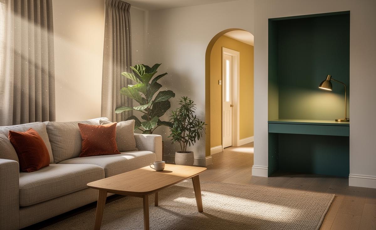
Room-by-Room Strategies for Mood and Energy
Living rooms thrive on colours that balance connection and recovery. Mid-tone greens (olive, sage) and warm neutrals (stone, taupe) steady the pulse, while terracotta or rust accents keep things sociable. Hallways, our psychological on-ramp, benefit from optimistic notes — a butter yellow or soft coral — that create approach motivation as you head out. Guide the eye with a gentle gradient from energising near the door to calmer deeper inside.
For bedrooms, tone everything down: desaturated blues, lavender greys or mushroom neutrals, paired with warm-white lamps, cue melatonin-friendly evenings. Avoid high-saturation reds or glossy finishes behind the headboard; save any drama for art that can be dimmed. Bathrooms benefit from spa-calm palettes — pale eucalyptus, putty, chalky white — and low-glare tiles. Soft contrast soothes the nervous system when you’re winding down.
In kitchens and home offices, you want clean energy, not caffeine jitters. Crisp off-whites with green or clay accents keep kitchens fresh; for offices, try muted teal or petrol blue, which supports focus without feeling cold. Add wood for warmth and matte surfaces to reduce screen glare. Renters can steer the palette with textiles: throws, lampshades, rugs and art. If repainting isn’t an option, textiles shift your palette in an afternoon.
| Colour Family | Emotional Nudge | Best Uses | Caution |
|---|---|---|---|
| Soft Blues | Calm, clarity | Bedroom, study | Too dark + low light can feel cold |
| Greens (mid-tone) | Balance, renewal | Living room, office | Neon greens overstimulate |
| Yellows (pale) | Optimism, warmth | Hallway, kitchen | High-chroma shades can glare |
| Reds/Corals | Energy, conviviality | Dining accents | Not ideal behind headboards |
| Warm Neutrals | Comfort, cohesion | Anywhere | All-beige schemes can feel flat |
| White (clean) | Light, space | Kitchens, studios | Needs texture to avoid sterility |
| Black/Charcoal | Focus, drama | Studios, small accents | Absorbs light; use sparingly |
Why Brighter Isn’t Always Better: Balancing Hue, Light, and Texture
Brightness can energise, but it isn’t a universal fix. High-reflectance paints and glossy tiles bounce light into your eyes, especially with low-angled winter sun, creating visual fatigue. Ultra-bright whites also amplify clutter. Chasing “maximum brightness” often delivers glare rather than joy. Better is to target useful brightness: clear task lighting over worktops, gentler glow where you rest, and colour that carries light forward without shouting.
Think in ratios. A classic 60–30–10 formula — 60% calm base, 30% supporting tone, 10% vivid accent — keeps harmony. Tune saturation and finish as much as hue: matte or eggshell on big walls, satin on trims, gloss only where you want sparkle. Layer texture (linen, rattan, wool) to soften light and add interest so the room doesn’t rely on colour intensity alone. Aim for gentle contrast that guides the eye, not a loud chorus that overwhelms it.
Test before you commit. Paint A4 swatches, move them around, and watch them morning, midday and night. North-facing? Add warmth. South-facing and dazzling? Drop the white point or add matte textures. If a favourite shade misbehaves, try it one step greyer or in smaller doses — a lampshade, a rug border, a single chair — to capture the feeling without the side effects.
Pros
- Brighter accents create momentum in entryways and kitchens.
- High-contrast palettes sharpen focus for desk zones.
- Gloss finishes are hard-wearing and lively for trims and doors.
Cons
- Excessive brightness produces glare and restlessness.
- Too much contrast fragments small rooms; they feel busy, not bigger.
- Gloss on large surfaces amplifies imperfections and visual noise.
Colour is a tool, not a doctrine. Start with how you want each room to make you feel in the first five minutes of morning and the last five minutes of night. Then adjust hue, saturation, contrast and finish to serve that script, one wall, lampshade or cushion at a time. When your palette supports your routine, your home becomes a co-pilot for better days. Which room in your home would benefit most from a mood-and-energy tune-up, and what’s the first colour change you’ll try this week?
Did you like it?4.5/5 (22)